Improving parcel delivery experience
Post App
In 2020, 165 million parcels were handled by the Austrian post. Compared to the previous years, it is an increase of 30%. On an average day, the Post is delivering 555.000 parcels. In December, this number peaks with an average of 800.000 parcels a day. To decrease high costs for delivering parcels, the first time delivery rate should be increased.
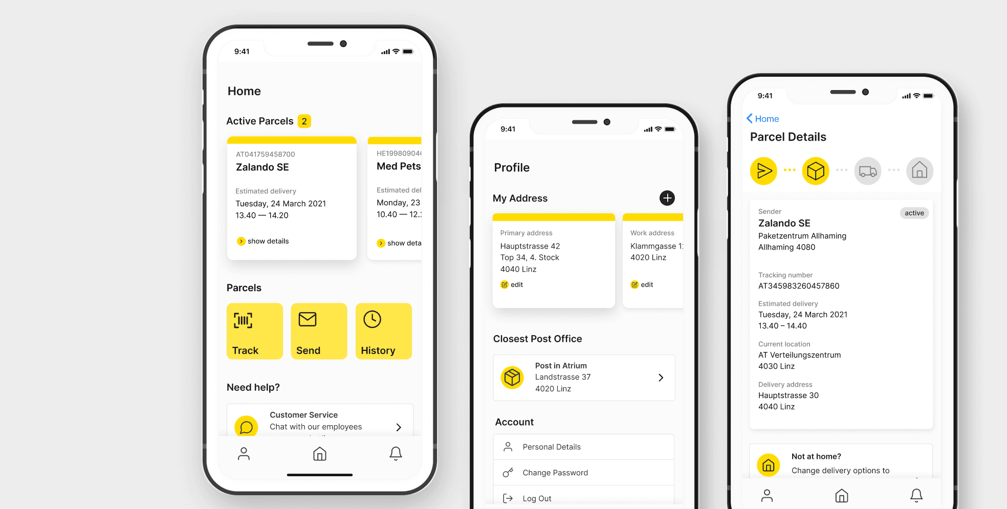
Project Details
Project Type
Mobile App, Concept
Role
Research & Concept, UI/UX Design
Date
2021-06-01
Company
University project
Design Process
Problem Statement
The company is facing high costs for delivering parcels to the client and back and storing these in their shops. To cut back on these costs and improve the clients’ experience, the first time delivery rate should be increased.
Our users are a wide range of demographics from all Austria. Austrian Post is the leading postal service in the country.
User Story map
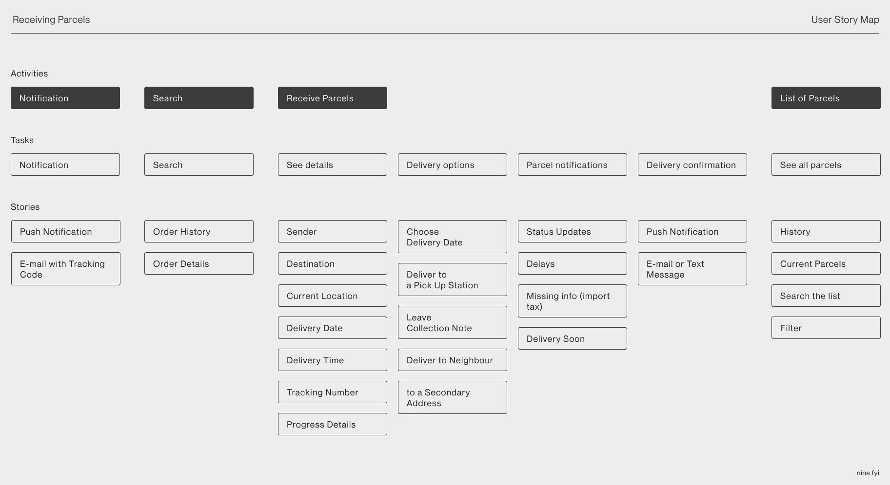
I created a user story map to see what activities and tasks are important for the use case. As for receiving parcels, users should be notified about updates related to their deliveries, search through their current and past parcels and see relevant details.
Wireframes
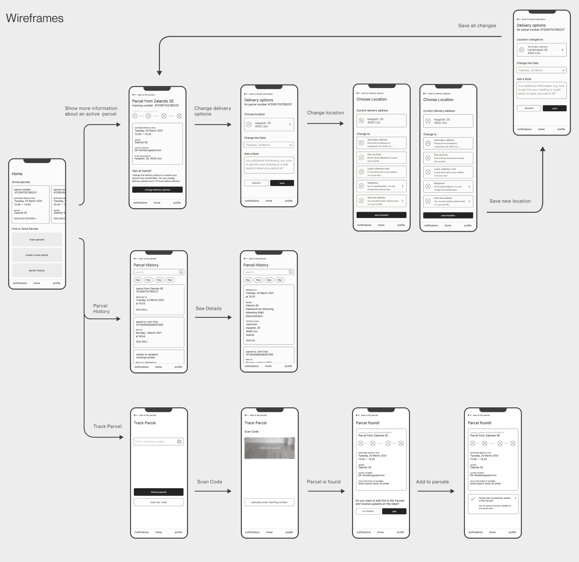
Based on the user story map, I developed wireframes. I made a clickable prototype, tested it with users and made improvements according to the user test results.
User Test
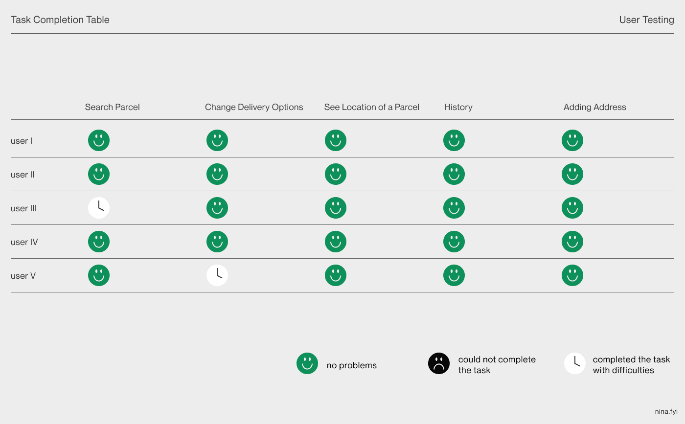
In user testing, interviewees were asked about their experiences with receiving parcels, experiences with the Post and its competitors and their behaviour when it comes to ordering and receiving packets. Then they were asked to complete five tasks:
- You are about to receive a parcel and have its number and/or bar code and want to track it. How would you do that?
- There is a parcel on the way to you, but you are not going to be home when it is delivered. Change the delivery option so that it suits you.
- You want to know the current location of a parcel you are about to receive. Where would you look for this information?
- Some time ago, you received a parcel. Now you want to know the date it was delivered to you, how do you find it?
- You live in two places and have two addresses. You want to add a secondary address to your profile. How do you proceed?
The users understood how to navigate through the app quickly and without any great problems. There were suggestions about renaming some actions or to add more descriptive elements. Adding active parcels to the parcel history was suggested. In my first prototype, consideration for incorporating customer service was missing — some users pointed this out.
Final Design
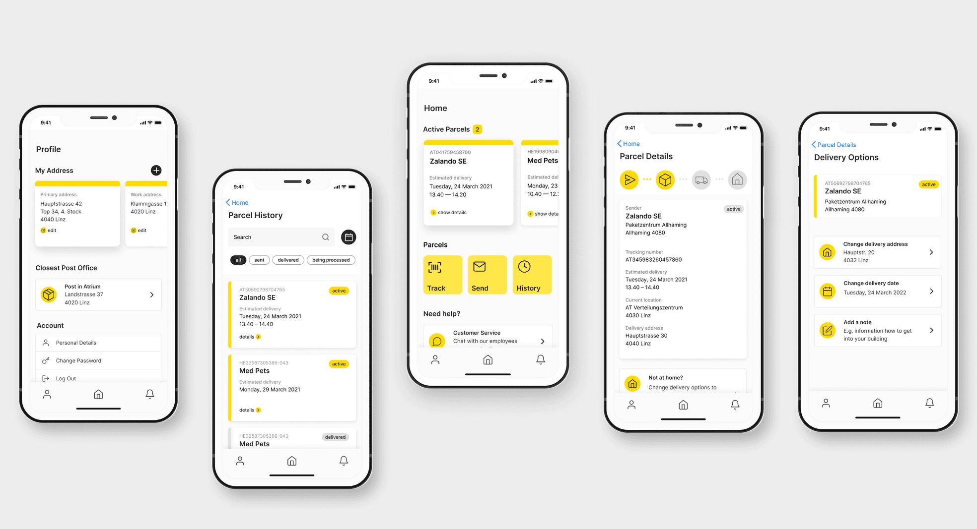
Conclusion
Possible Improvements
Insights into how the Post is planning routes when delivering parcels would help with the design process, to know how many changes can be made to a delivery. A limit to the distance of Proseerting a parcel needs to be set out of logistic reasons. Moreover, the time frames for deliveries made by the Post are too big (e.g. “delivery today between 7:45 — 14:00”) and are often of little value to the recipients. To improve these predictions, information about the workflow and workings of the company could lead to better planning and delivery estimation.
Learnings
I have learned how different users approach deliveries and was surprised by how different their behaviour was. Seeing users navigating the prototype without difficulties was a rewarding experience. Based on this project, I was hired as UI/UX Design Intern at Ebcont, where I had the opportunity to work with an amazing team working on the Austrian Post App and other projects.