UI Components for nista.io
Design Library
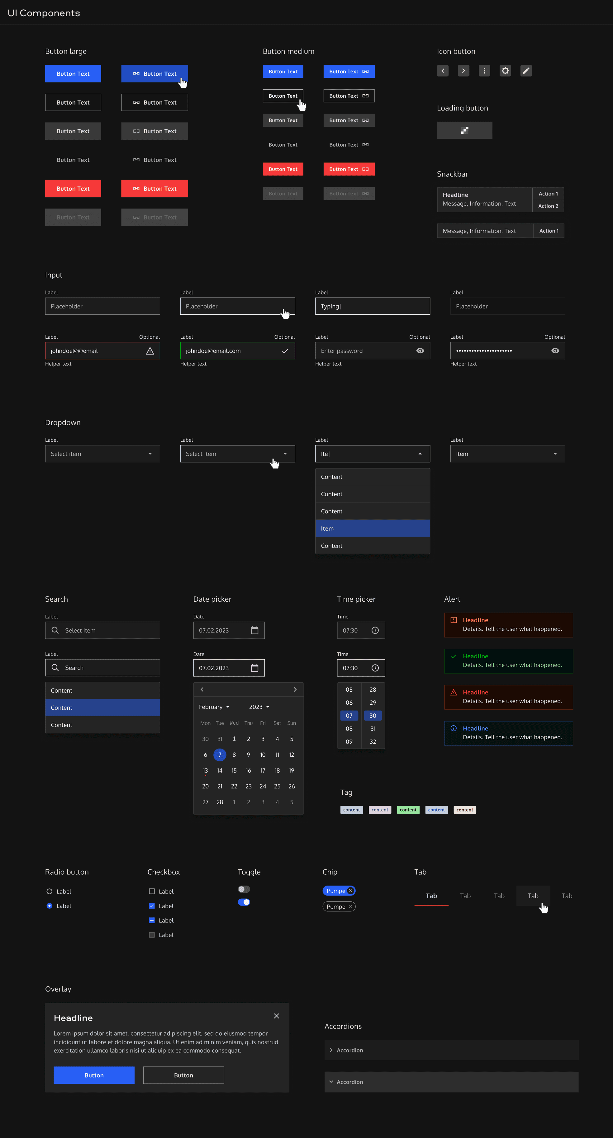
Design component libraries are a useful way of ensuring consistency across applications. To bring consistency into designs, save time, effort and improve collaboration at nista.io, we have designed a component library that makes it easy to reuse UI elements.

Project Details
Project Type
Design Library
Role
UI/UX Design
Date
2023-11-01
Company
nista.io
The challenge
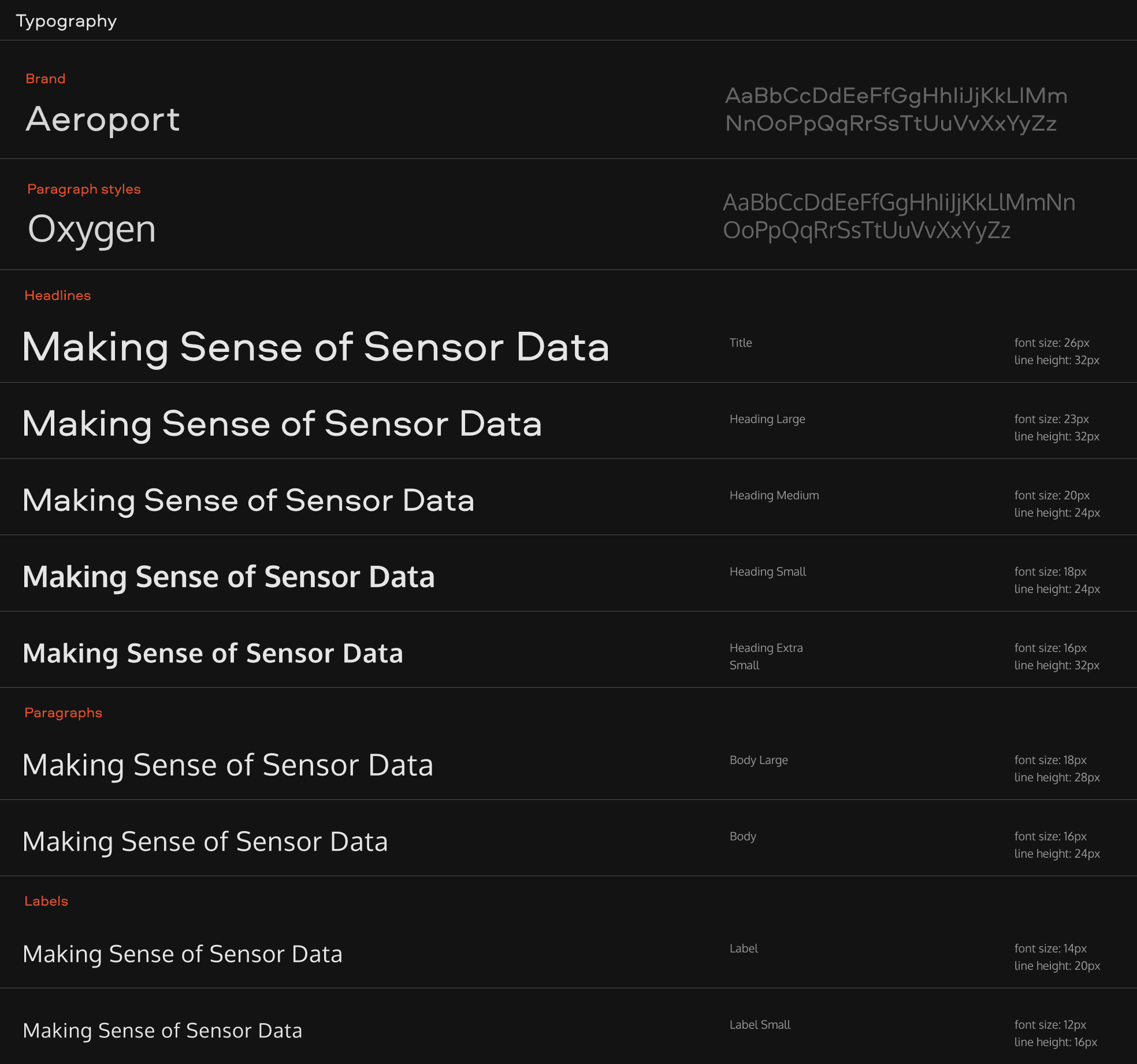
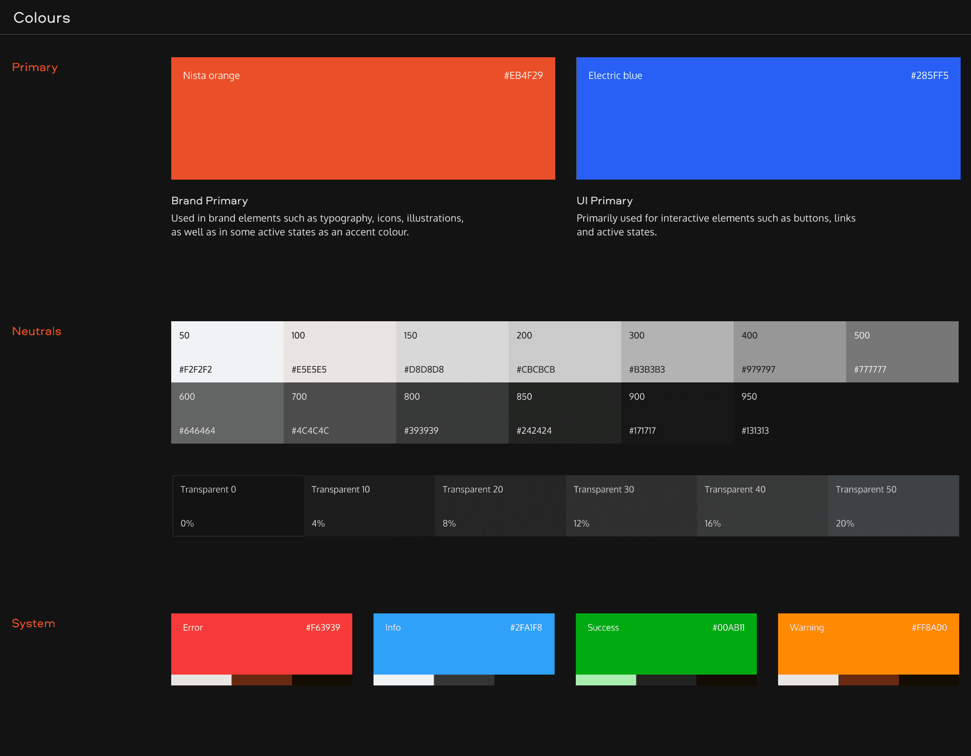
The challenge of this project has been to translate nista branding and expand beyond it where needed. While staying true to the nista brand identity, we have extended the colours to meet the requirements of modern user interfaces for system states (e.g. success, error states). To improve readability, we opted for using a humanist sans serif typeface Oxygen for paragraph styles and smaller font-sizes. Based on these essential building blocks — colour and typography — we went on and created reusable UI components. From input fields, drop downs and buttons to alerts, time pickers, tables and more.
Nista's design library is a living organism. We adapt, extend, eliminate based on the needs — whether it is the needs of our team, users or customers. Next steps include defining and enforcing processes in both design and development to streamline internal nista.io workflows and therefore, steadily transition to a design system.


